A push notification ad is built from three core elements – title, icon, and image – and each one has a measurable, independent effect on CTR. The title drives the click decision in the first half-second, the icon builds trust and recognition, and the large image adds visual context that can double engagement compared to icon-only creatives. Below we break down each element and how to optimize it.
What a push notification ad actually consists of
Push notification advertising is a format where an ad is delivered directly to a user’s device – desktop or mobile – through the browser’s or OS’s native notification system, without the user needing to be on a specific website. Unlike popunder and clickunder ads, push ads appear even after the user has left the site that triggered the subscription.
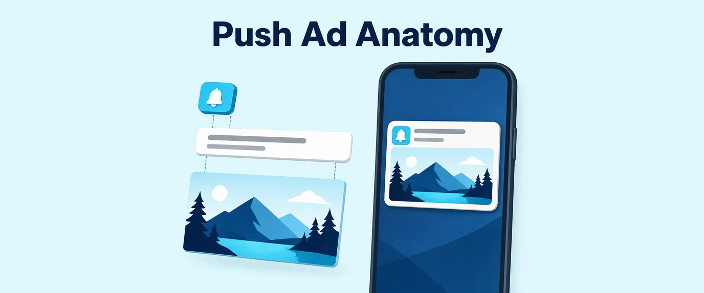
A standard push creative is made up of four components:
- Icon – a small square image, always visible, representing the sender or brand.
- Title – the bold headline text, the first thing a user reads.
- Description text – a shorter secondary line beneath the title.
- Large image – an optional wide banner shown below the text on supported platforms.
Each of these elements competes for a fraction of a second of user attention, which is why their design and copy need to be treated as separate optimization variables rather than a single “creative.”
Title: the element that decides whether the ad gets read
A push notification title is the primary text line that determines whether a user opens, ignores, or swipes away the notification. Because it appears in a crowded notification shade alongside system alerts and other apps, the title has to do most of the persuasive work in a very limited space.
Title length and truncation
Most operating systems and browsers cut off push titles after a certain character count, hiding the rest behind an ellipsis. Recommended limits by platform:
| Platform | Recommended title length | Typical truncation point |
|---|---|---|
| Android (Chrome) | 30-40 characters | ~45-50 characters |
| Windows (Chrome/Edge) | 40-50 characters | ~60-65 characters |
| macOS (Safari) | 30-40 characters | ~50 characters |
A title that gets cut off mid-word looks unprofessional and often hides the key benefit, so it’s safer to stay under the shortest platform limit rather than the longest.
Title copywriting best practices
- Lead with the benefit, not the brand. Users scan for what’s in it for them before they register who sent the message.
- Use numbers and specifics. “3 slots left today” outperforms vague phrases like “Great offer inside.”
- Add urgency sparingly. Words like “today” or “now” work, but overused urgency across every send trains users to ignore it.
- Use one relevant emoji at most. A single well-placed emoji can improve visibility; two or more often reads as spam.
- Match the title to the landing page. A mismatched promise between title and destination increases bounce rate and can hurt long-term subscriber quality.
An expert comment from the performance marketing community: title testing is consistently reported as the single highest-leverage variable in push campaigns, often producing larger CTR swings than changes to bid, geo, or even the image.
Icon: the trust signal users register subconsciously
A push notification icon is a small square graphic, typically 192×192 pixels, that appears next to the title and description in the notification. Because of its size, the icon is processed almost instantly and subconsciously, functioning more like a trust signal than a detailed visual.
Icon design guidelines
- Keep it simple. A single symbol, letter, or simple illustration reads better at small sizes than a detailed logo.
- Use high contrast. Icons with strong contrast between foreground and background stay legible on both light and dark notification themes.
- Avoid text in the icon. Small text becomes unreadable at 192×192 px and is often blurred by compression.
- Stay consistent across a campaign. Swapping icons too often between sends can reduce recognition-based trust from returning users.
- Match the vertical. A finance-style icon (bank, coin, shield) tends to outperform generic icons for finance offers, and the same logic applies across verticals like native ad campaigns.
Large image: the element that adds visual storytelling
A push notification image is an optional wide banner, usually around 720×480 pixels, displayed beneath the title and text on platforms that support rich push notifications. Unlike the icon, the image has room to tell a short visual story – a product shot, a before/after, a face expressing emotion, or a screenshot of an app interface.
When a large image improves performance
- Product-based offers – showing the actual product increases perceived legitimacy and can lift CTR noticeably compared to icon-only ads.
- Emotional hooks – a close-up human face showing surprise, joy, or concern tends to draw the eye faster than abstract graphics.
- Proof-style creatives – screenshots of chat messages, notifications, or dashboards can work well for app-install and finance offers.
- Sweepstakes and gaming offers – bright, high-contrast images with a clear visual reward (cash, prizes, spinning wheels) typically outperform plain product shots.
When to skip the large image
Not every campaign benefits from adding an image. Loading time, data usage on mobile connections, and cluttered notification design can offset the benefit in some cases:
| Scenario | Recommendation | Reason |
|---|---|---|
| Low-bandwidth GEOs | Icon-only or smaller image | Faster load, lower drop-off |
| Very short, urgent offers | Icon-only | Simplicity matches the message tone |
| High-CTR product offers | Large image | Visual proof increases perceived value |
| Broad awareness campaigns | Large image | More surface area to communicate the message |
Combining title, icon, and image into one creative
The three elements should reinforce a single message rather than compete with each other. A common mistake is writing an urgent, benefit-driven title while pairing it with a generic stock icon and an unrelated image, which creates a disconnect that lowers trust and click-through.
A simple combination checklist:
- Does the icon visually match the vertical of the offer?
- Does the image support or extend the title’s promise, rather than repeating it?
- Would the ad still make sense with the image stripped out, in case a device doesn’t render it?
- Is there a single, consistent color or visual theme running across all three elements?
This is the same logic that applies across smartlink advertising funnels, where creative consistency between the ad and the landing offer directly affects conversion rate.
Testing and creative fatigue
Even a well-built push creative loses performance over time as the same audience segment sees it repeatedly. This effect, known as creative fatigue, typically shows up as a gradual CTR decline over 1-3 weeks depending on audience size and frequency settings – a factor closely tied to frequency capping strategy.
- Run title A/B tests first, since title changes usually produce the largest performance swings.
- Test icon variations second, especially across different verticals or seasonal promotions.
- Rotate large images every 1-2 weeks to keep the same offer feeling fresh to returning subscribers.
- Track CTR by day, not just by campaign total, to catch fatigue early before overall performance drops significantly.
Both advertiser and publisher accounts on major ad networks typically expose these metrics at the creative level, making it possible to spot underperforming titles, icons, or images individually rather than guessing from blended campaign data. On mobile traffic, this optimization pairs well with an Android SDK integration for more granular device-level reporting, and with RTB buying for real-time creative and bid adjustments.
Frequently Asked Questions
What is the ideal title length for a push notification ad? Aim for 30-40 characters, since most devices truncate longer titles and cut off the key message before users see it.
What size should a push notification icon be? The standard recommended size is 192×192 pixels in PNG or JPG format, optimized for fast loading and clarity at small display sizes.
Does the image in a push ad really affect CTR? Yes, adding a large image typically increases CTR compared to icon-only ads by giving the notification more visual context and presence.
What’s the difference between a push icon and a push image? The icon is a small, always-visible square graphic representing the brand, while the image is an optional larger banner shown below the text for extra visual impact.
How often should push creatives be refreshed? Most media buyers refresh creatives every 1-2 weeks, since CTR tends to decline as the same audience sees the same title, icon, and image repeatedly.
Can emojis in a push title improve performance? A single well-placed, relevant emoji can boost visibility in the notification shade, but using multiple emojis often looks like spam and hurts trust