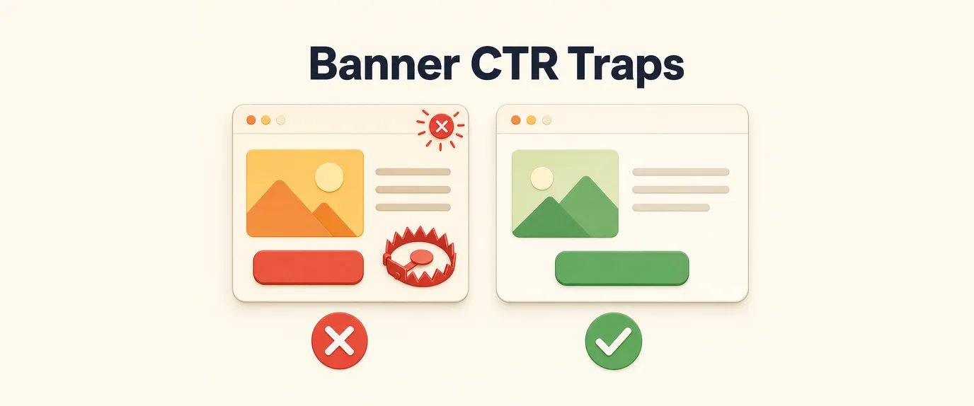
A banner can “crush it” on CTR and still fail at sales. And the opposite happens too: it may look less flashy, get fewer clicks, yet bring in real revenue. The reason is simple: CTR measures a reaction to a promise, while conversion measures the fulfillment of that promise (and whether you attracted the right people).
Below is a practical breakdown of how to tell CTR traps from conversion-driven banners—and how to build creatives that don’t just get clicks, but generate leads and purchases.
1) What a CTR Trap Is (and Why It “Works”)
A CTR trap is a banner designed to maximize curiosity/emotion/shock—but it doesn’t qualify the audience and often doesn’t match what’s on the landing page.
Common signs:
- The promise doesn’t match the product—or it’s overly generic.
- It triggers “clicks for the sake of clicking”: to see what’s next, to check, to laugh.
- There’s no qualifying context: no price, audience, format, or limitations.
- Too much hype: “SUPER DISCOUNT,” “SHOCK,” “URGENT,” “FREE”—with no specifics.
CTR-trap example:
“URGENT! -70% TODAY ONLY 😱 CLICK NOW!”
What happens: lots of clicks.
Then: the landing page reveals “up to -70%,” only on one item, requires a promo code, has a minimum order, etc. Users feel tricked → bounces, low conversion, expensive leads.
2) What Conversion Banners Do Differently
A conversion banner doesn’t try to appeal to everyone. Instead, it:
- Explains what it is instantly
- Signals who it’s for
- Offers a specific benefit
- Sets an expectation of what happens after the click
- Leads to one clear next step
Yes—these banners can have lower CTR because some people self-select out. But the ones who do click are more intentional—and convert far better.
3) The Core Principle: A Banner Is a Filter, Not Bait
If you want conversions, your banner should not only attract—it should qualify. That means including “anchors” that filter out the wrong audience:
- Price “from…” / minimum order / price range
- Format (online/offline, delivery/pickup, subscription/one-time)
- Geo (Kyiv, Ukraine-wide, Lviv only)
- Audience (“for beginners,” “for businesses with 10–50 employees”)
- Condition (“after consultation,” “request → quote in 10 minutes”)
Your CTR might drop. But CR, CPA, and lead quality usually improve.
4) Principles of Banners That Convert
Principle 1. One banner = one message
Don’t try to cram in “quality, warranty, delivery, discount, installment plan.” Aim for:
1 offer + 1 proof point + 1 action.
Formula:
- Headline: what the person gets
- Subheadline: for whom / what’s different / key condition
- CTA: the next step
Example (service):
Headline: “A lead-focused landing page in 10 days”
Subheadline: “For experts and small businesses. Wireframe + design + build”
CTA: “Get an estimate”
Principle 2. Specifics beat adjectives
“Best,” “unique,” “great value” are empty words. Conversions are driven by numbers, timelines, formats, and constraints.
Bad: “Amazing English course”
Good: “English A2→B1 in 8 weeks. 3 classes/week”
Principle 3. Match the banner to the landing page’s first screen
If the banner promises “20% off subscription,” then the landing page should show on the first screen:
- “20% off subscription”
- And the conditions (not hidden in tiny text 5 sections down)
Otherwise, you’re buying clicks—not customers.
Principle 4. Remove “unnecessary curiosity”
Curiosity boosts CTR but often destroys qualification.
CTR trap: “You won’t believe what happened to your…”
Converter: “Eye exam in 15 minutes. Book online”
Principle 5. Place proof next to the offer
People don’t read long text on banners. Keep trust signals short and concrete:
- “4.8★ (2,140 reviews)”
- “Since 2016”
- “12-month warranty”
- “3,000+ orders”
- “Certified specialists”
Principle 6. CTA = not “click,” but “what you’ll get”
Bad: “Learn more,” “Click”
Good: “Calculate price,” “Book now,” “Get the catalog,” “Choose your size”
The CTA must match the funnel stage.
Principle 7. Visual hierarchy: 3 levels
In 1 second, it should be clear:
- Main meaning (headline)
- Clarifier (subheadline/condition)
- Action (CTA)
If the eye “wanders,” you lose conversions even with decent CTR.
5) Examples: CTR Trap → Rebuilt into a Conversion Banner
Example A: Online clothing store
CTR trap:
“-80% ON EVERYTHING! TODAY ONLY”
Problem: It’s “up to -80%,” limited category, sizes run out. Many accidental clicks.
Converter:
Headline: “Winter jackets −30%”
Subheadline: “Sizes XS–XL. Delivery across Ukraine in 1–2 days”
CTA: “Choose a jacket”
Example B: Online course
CTR trap:
“Learn a new profession and earn a lot!”
Problem: Too broad; everyone clicks “just to see.” Leads are cheap but low-quality.
Converter:
Headline: “QA Tester from scratch in 10 weeks”
Subheadline: “Evening schedule. Homework + projects. Mentor support”
CTA: “Download the syllabus”
Example C: Food delivery
CTR trap:
“HUNGRY? CLICK!”
Problem: No cuisine, no price point, no geo—too many unqualified clicks.
Converter:
Headline: “Sushi set for two from 499 UAH”
Subheadline: “Delivery in Kyiv: 60–90 minutes”
CTA: “Choose a set”
Example D: Renovation services
CTR trap:
“Apartment renovation fast and cheap!”
Problem: “fast/cheap” attracts everyone, then people churn on price or lack of specifics.
Converter:
Headline: “Turnkey renovation from 6,500 UAH/m²”
Subheadline: “Estimate within 24 hours. Contract + warranty”
CTA: “Get an estimate”
6) Quick Checklist Before You Launch
If you answer “no” to 2+ items, you’re probably building a CTR banner—not a conversion banner.
- Is it clear in 1 second what this is?
- Is there specificity: price/timeline/format/geo?
- Is it clear who it’s for?
- Does the promise match the landing page’s first screen?
- Is there a short trust proof point?
- Does the CTA describe what the user gets after clicking?
- Does the banner filter out some people (and that’s okay)?
7) How to Test Correctly (So CTR Doesn’t Fool You)
To avoid “clickability ≠ profit,” test in this order:
- Conversion to the target action (purchase/lead) — the main KPI
- CPA/CPL — cost per result
- Post-click CR — traffic quality
- CTR — only as a diagnostic metric at the creative level
Sometimes the best converter has a CTR that’s 1.5–2× lower—and that’s perfectly fine.
Conclusion
CTR traps win the first second.
Conversion banners win at checkout.
If you want sales/leads:
- Use the banner as a filter,
- Add specifics and conditions,
- Sync the creative with the landing page,
- And replace “click” with what the user gets.