Same offer, same traffic source, but… on mobile everything flies, while on desktop the stats are painful. Sounds familiar?
In many cases the problem isn’t the offer or the traffic, but the fact that creatives are made “one size fits all devices.” User context, screen size, device orientation, expectations, and even “thinking mode” differ a lot between mobile and desktop — and your ad should reflect that.
In this article, we’ll look at how to adapt creatives for:
mobile-only traffic,
desktop-only traffic,
mixed traffic (when both device types are significant).
1. The Key Difference: Usage Context by Device
Before you start rewriting headlines and redesigning images, it’s important to understand what state the person is in when they see your ad.
Mobile
Most often “on the go”: public transport, queues, couch, parallel scrolling through social feeds.
Attention is scattered, sessions are short.
Mostly vertical viewing, smaller screens.
Actions are quick and impulsive: click, swipe, subscribe, install.
Conclusion: on mobile, brevity, simplicity, large UI elements and immediate value win.
Desktop
More of a “work” or “home office” context: office, laptop, desktop PC.
Sessions are longer, average concentration is higher.
Larger screens, more space for copy, visuals, tables, comparisons.
The user is more ready to read, compare and explore.
Conclusion: on desktop you can lean on more detail, reasoning and comparative advantages.
Mixed Traffic
Mixed flow where some users see your ad on a phone, others on a PC.
The same campaign can perform very differently depending on device.
Conclusion: without adapting creatives by device type, you’ll lose part of your conversions “along the way.”
2. Adapting Headlines: Length, Focus, Tone
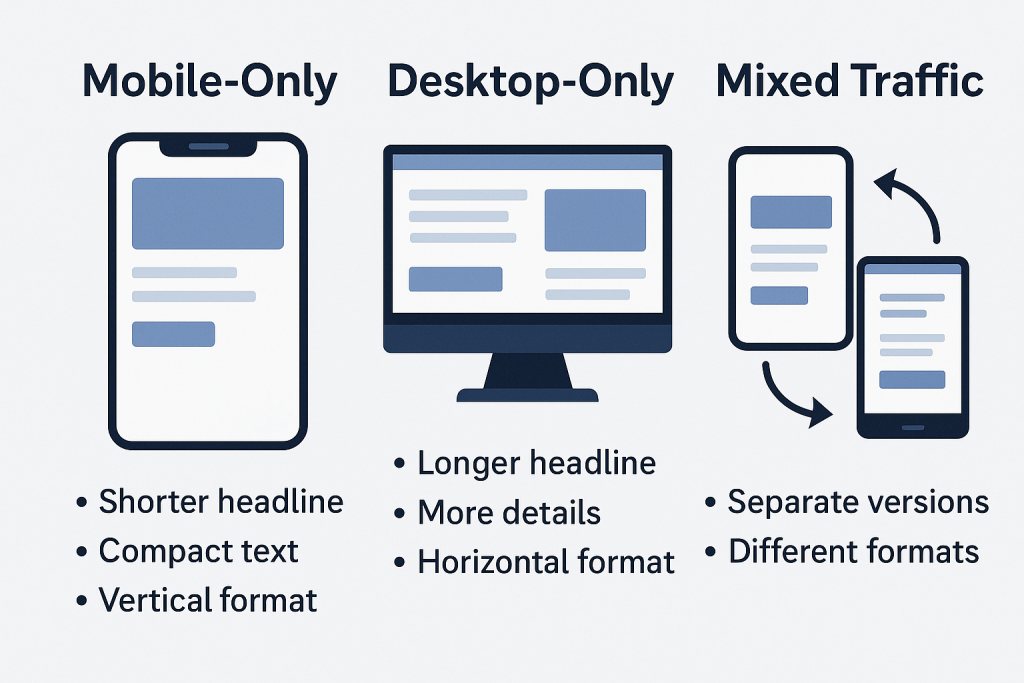
For Mobile-Only
Goal: convey the core message in the first 2–4 words.
Recommendations:
Use short, punchy phrases:
“Earn from your phone”
“50% off today”
“Find a job in 5 minutes”
Try to combine one key action + one benefit:
“Download the app — get cashback”
Avoid complex phrasing and long subheadings — they’ll be cut off or simply ignored.
For Desktop-Only
Goal: explain the value a bit more clearly and precisely.
Recommendations:
You can use longer headlines:
“Automate reporting and save up to 10 hours a week”
Add clarification and segmentation:
“Analytics platform for e-commerce and info products”
Comparisons and specifics work well:
“A CRM you can implement in 1 day”
“Ad network where you pay only for qualified actions”
For Mixed Traffic
Create two versions when possible: a shorter one (for mobile placements) and an extended one (for desktop).
If you must use a single version, optimize for the mobile constraints and push more context into the description/body text.
3. Ad Body: How Much Text You Can Get Away With
Mobile
Your copy should be:
highly structured;
split into short phrases;
without text “walls.”
A good pattern:
1–2 lines describing the user’s pain/problem.
1–2 lines with the solution.
Clear call to action: “Install”, “Open”, “Try now”.
Example (mobile format):
Struggling to keep your spending under control? Our app helps you track your budget automatically. Install it and see where your money really goes.
Desktop
Here you can add details, mechanics, and product features:
describe key functionality;
use bullet points;
mention integrations, conditions, guarantees.
Longer text = more chances to handle objections before the click.
Example (desktop):
Finding it hard to manage both business and personal expenses? Our service automatically pulls data from your cards and accounts, categorizes your spending, and shows where you’re losing money. Perfect for freelancers, small business owners, and sole proprietors.
Mixed
For mixed traffic, it’s smart to use a shared “skeleton” structure but with different text lengths per device where possible.
If the platform doesn’t allow that, write so that the first 2–3 lines work as a standalone creative. Everything below becomes a bonus for desktop users.
4. Visuals: Format, Size, Composition
Mobile-Only
Core principle — your idea must be readable in 1–2 seconds.
Large elements:
big face/object;
large text (if you use text on the image);
clear icon or illustration of the action.
Avoid:
tiny details, tables, maps, complex charts with tiny fonts;
overloaded backgrounds.
Vertical and square formats often perform better:
1:1, 4:5, 9:16.
Desktop-Only
You can afford a bit more “complexity” here:
Add interfaces, charts, product screenshots, as long as they’re readable and don’t turn into visual noise.
Use horizontal formats (16:9, 1200×628, etc.).
Leverage visual metaphors and more nuanced creative concepts — users can process more detail.
Mixed Traffic
Create at least two sets of creatives:
for mobile placements (vertical/square);
for desktop (horizontal).
Don’t try to cram everything into a single image — split ideas across multiple creatives and test them.
5. CTA and Landing Pages
Mobile
Your call to action should be as concrete and lightweight as possible:
“Install the app”
“Open in one tap”
“Get your bonus”
Landing page after the click:
Must be fully mobile-optimized (load speed, font sizes, buttons, forms).
Minimum fields, maximum simplicity.
Desktop
Your CTA can be a little “heavier” and more deliberate:
“Request a demo”
“View pricing”
“Download the deck”
On desktop, users are more willing to read, compare, fill in forms and watch videos. The landing page should support that:
pricing tables;
“how it works” blocks;
FAQ, case studies, testimonials.
Mixed
If traffic goes to the same URL, make sure you have:
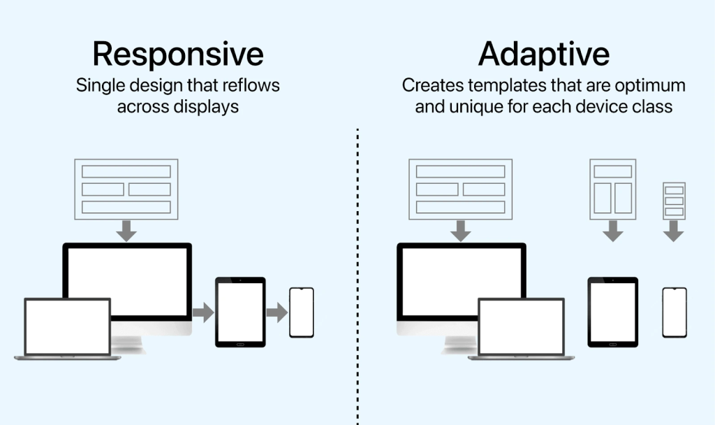
responsive design (different view for mobile/desktop);
optionally, different CTAs by device via UTM or dynamic tools, if available.
6. Special Pain Point: Push, Native and Banners
Different formats render differently on various devices, and that matters too.
Push Notifications
On mobile, push content is often cut by length, so:
the headline must be as short and punchy as possible;
the body text — 1–2 short sentences;
the icon — simple and recognizable.
On desktop, push banners might be larger, but users still won’t carefully read long texts.
The rule of thumb: build creatives by mobile rules first, then double-check how they look in desktop browsers.
Native Ads
On mobile:
large, lifestyle images work well;
headlines should be clear and concrete, not overly “newspapery.”
On desktop:
you can use longer, article-style headlines;
comparisons, numbers, and insights perform well.
Banners
Mobile: minimal detail, big visual focus.
Desktop: you can add a second layer of meaning (UI, product features, smaller elements — but don’t overdo it).
7. How to Test and Optimize Creatives by Device
Break down stats by device Don’t look at CTR/CR in aggregate. Quite often mobile pulls the averages up while desktop quietly dies (or vice versa).
Duplicate campaigns by device One campaign for mobile, another for desktop. Each with its own creatives and bids.
Test one change at a time Run separate tests for:
headline only;
image only;
CTA only.
Watch post-click behavior Monitor bounce rate, time on site, depth, registration/conversion. If CTR is fine but conversions are not, the problem is either in the promise your creative makes, or in the mobile/desktop version of the landing page.
Schedule regular “device reviews” Every 1–2 weeks, review stats by device:
which creatives work best on mobile;
which ones on desktop;
where you should split campaigns and adjust your approach.
8. Bottom Line: One Offer — Three Different Scenarios
If we simplify, it looks like this:
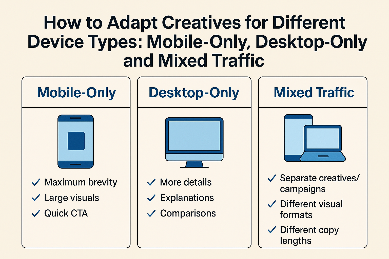
Mobile-only: maximum brevity, large visuals, quick CTA, extremely simple landing.
Desktop-only: more details, explanations, comparisons, “heavier” CTAs (demo, pricing, registration).
Mixed traffic: separate creatives/campaigns per device, different visual formats, different copy lengths, bid adjustments.
The earlier you stop thinking in terms of a “universal creative” and start thinking in terms of a “creative for a specific screen and context”, the easier it will be to scale your campaigns without endlessly raising bids and burning budgets for nothing.
Conclusion
Adapting creatives to different device types is essential for maximizing performance and maintaining a seamless user experience across advertising platforms. Mobile users expect fast, concise, vertical-first visuals, while desktop users engage better with detailed messaging, wider formats, and richer layouts. For campaigns targeting mixed traffic, it’s best to build adaptive creatives that scale and reposition elements depending on screen size.
By tailoring asset formats, message density, CTA placements, and visual hierarchy to the user’s device, brands can increase click-through rates, improve conversions, and reduce wasted ad spend.
Traffic Type
Recommended Aspect Ratios
Creative Focus
Text Density
CTA Placement
Best Practices
Mobile-Only
9:16, 1:1, 4:5
Vertical-first visuals, simple layouts
Low – short and bold
Center or bottom with high contrast
Use large fonts, high-speed storytelling, thumb-friendly spacing, optimized file size
Desktop-Only
16:9, 1.91:1, 4:3
Wider scenes, more detail, product depth
Medium–High
Top-right or bottom-right
Use readable typography, accommodate scan-based reading, include more product info
Mixed Traffic
Adaptive sets: 9:16 + 1:1 + 16:9
Universal designs, flexible compositions
Medium
Flexible – ensure visibility in both vertical and horizontal crops
Provide multiple asset ratios, keep safe zones, test cross-device performance