Monetization is almost always a balancing act: more ads can mean more revenue, but also a worse user experience, lower time-on-site, and weaker SEO signals. The good news: you can combine push + native + banners into a single ad stack that stays stable without turning your site into a casino or triggering search engine penalties.
Below is a practical framework: what to implement, where to place it, in what order, what caps to set, and how to avoid destroying Core Web Vitals.
1) What an “Ad Stack” Is (and Why “Three-in-One” Works)

An ad stack is not “adding more formats.” It’s a system where:
- Banners provide baseline, predictable revenue,
- Native ads raise eCPM thanks to better fit and CTR,
- Push adds off-page monetization and, more importantly, retention (bringing users back).
The key: these formats must not compete for the same attention hotspot and must not break performance and layout stability.
2) Core Principles to Protect UX and SEO
Principle A: Don’t Block the User From Actually Reading
If the user hasn’t even understood the article yet, and you hit them with:
- a sticky banner,
- auto-refreshing placements,
- a push permission prompt,
- clicky “recommended content” units,
…they’ll bounce. Engagement drops, and SEO usually follows.
Rule: keep the first 5–8 seconds or the first 25–35% of scroll as clean as possible.
Principle B: Core Web Vitals Matter More Than “One Extra Banner”
Most common CWV killers:
- heavy JS from ad networks,
- unexpected layout shifts (CLS),
- render-blocking scripts (LCP/INP),
Rule: load ads lazily, reserve space for each slot, and defer scripts aggressively.
Principle C: Frequency Capping and Density Limits
Too many impressions = banner blindness + irritation + ad fatigue.
Starter caps:
- Banners: 2–4 slots per article (depending on length)
- Native: 1–2 blocks
- Push: one “ask” per session / every few days, no aggression
3) Architecture: The “Attention Funnel” by Scroll Depth
Think of your page as a user journey.
Zone 0: Above the Fold (First Screen)
Goal: let the user read the headline, understand value, and start scrolling.
Recommendations:
- Don’t run a heavy sticky unit on the first screen on mobile.
- If you must place an ad, keep it to one lightweight format:
- 320×100 (mobile), 728×90 (desktop) — but avoid layout jumps.
Technical must: reserve container height to prevent CLS.
Zone 1: 20–40% Into the Article (After the Hook)
This is the best moment for in-article native: the user is already engaged, and the unit feels less disruptive.
Placement:
- after 2–3 paragraphs or after the first subheading
- styled like a “recommended” card but clearly labeled Ad / Sponsored
Why it helps UX/SEO: less annoying than banners, usually higher CTR, and less incentive to chase clicks at the expense of content quality.
Zone 2: Mid-Article (40–70%)
Here you can add a second banner (especially for long reads) or a second native — but not both back-to-back.
Anti-cannibalization rule:
- If you place native, keep the next banner at least 2–3 screens away.
- Never place two ad blocks consecutively.
Zone 3: End of Article (After Summary / CTA)
Best place for:
- native “related content” recommendations,
- a final banner (only if it doesn’t sabotage the CTA),
- a gentle subscription prompt — and this is where push can be appropriate.
4) Push: How to Implement Without Annoying Users

Push rarely harms SEO directly, but it can destroy trust and retention if done aggressively. Showing the browser permission request immediately usually leads to rejection.
Use a Two-Step Prompt (Non-Negotiable)
- Your own pre-prompt (not the browser prompt):
- small, unobtrusive,
- explains the benefit (“Get new posts once a day/week”),
- buttons: “Yes” / “Not now”.
- Only after “Yes” do you show the system browser permission.
Best Timing
- after 50–70% scroll, or
- on the second visit (often the best option), or
- after a clear user action (“Get updates”).
Frequency Rules
- If the user denies: don’t show again for 7–14 days.
- If they close: retry in 3–7 days.
- If they subscribe: no more prompts — only settings/options.
Important: push isn’t “another ad slot.” It’s a retention channel first, monetization channel second.
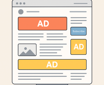
5) Banners: Safe Formats and Practical Limits

What Users Hate Most
- full-screen interstitials on entry,
- sticky units covering content on mobile,
- “jumping” ads (CLS),
- autoplay audio/video.
Recommended Baseline Setup
Mobile:
- Top: 320×100 or 320×50 (100 is often better, but watch LCP)
- In-article: 300×250 (mid)
- Bottom: 320×50 (only if it doesn’t cover navigation)
Desktop:
- Top: 728×90
- Sidebar: 300×600 or 300×250 (only if the sidebar is actually visible/used)
- Mid-article: 300×250 (optional)
Sticky: Yes, But “Quietly”
- Not on the first screen
- Closable
- No more than ~10–15% of viewport height on mobile
- Never cover menus or important buttons
6) Native: Make It Native, Not “Disguised Banner”
Native works best when it matches the site’s flow but stays transparent.
Native Checklist
- Clear label: Ad / Sponsored
- No trashy clickbait (“SHOCKING!”)
- Optimized images (WebP/AVIF) + lazy loading
- Max 1 unit per 2–3 screens
Where Native Performs Especially Well
- reviews, roundups, and listicles
- news feeds
- “related posts” sections at the bottom
7) Technical Setup: How Not to Tank CLS/LCP/INP
CLS (Layout Shifts)
- Always reserve height for ad containers
- Don’t inject units after render without pre-allocated space
- If height is dynamic, use min-height and stabilize transitions
LCP (Largest Contentful Paint)
- Don’t load heavy ad scripts synchronously in the head
- Defer ad scripts
- Avoid large media ads above the fold
INP (Interaction to Next Paint)
- Reduce concurrent third-party scripts
- Load networks sequentially on mobile when possible
- Limit the number of bidders/partners in wrappers
8) Quality Policy: “Ads With Rules”

To keep your stack sustainable, set simple product/editorial rules:
- Keep ad density under ~30–35% of visible screen area (roughly).
- Never place two ad blocks consecutively.
- No aggressive entry popups.
- Push only via pre-prompt and after engagement.
- Performance beats “+1 slot.” If CWV drops, cut.
9) Ready-to-Use Starter Layout
Article 6–10k characters (Mobile)
- Top banner (lightweight, space reserved)
- Native after the first subheading
- Mid banner 300×250 around the middle
- Related content (native recommendations) at the bottom
- Push pre-prompt at 60–70% scroll (max once per 7–14 days)
Desktop
- Top banner + sidebar banner
- Then the same logic: native in-article + optional mid banner
10) How to Tell It’s Working (Metrics)
UX / Engagement
- Bounce rate doesn’t rise after enabling the format
- Scroll depth stays stable
- Time on page doesn’t drop
SEO / Performance
- CLS stays low and stable (no jumping)
- LCP doesn’t worsen on key templates
- Mobile performance doesn’t turn “red”
Revenue
- Native eCPM increases without killing viewability
- Total RPM grows due to smart mix, not overload
Final Takeaway
The secret to push + native + banners without UX/SEO loss isn’t a magic plugin — it’s discipline:
- scroll-based sequencing (value first, monetization second),
- caps and frequency control,
- technical hygiene (CLS/LCP/INP),
- transparency (label native, explain push).